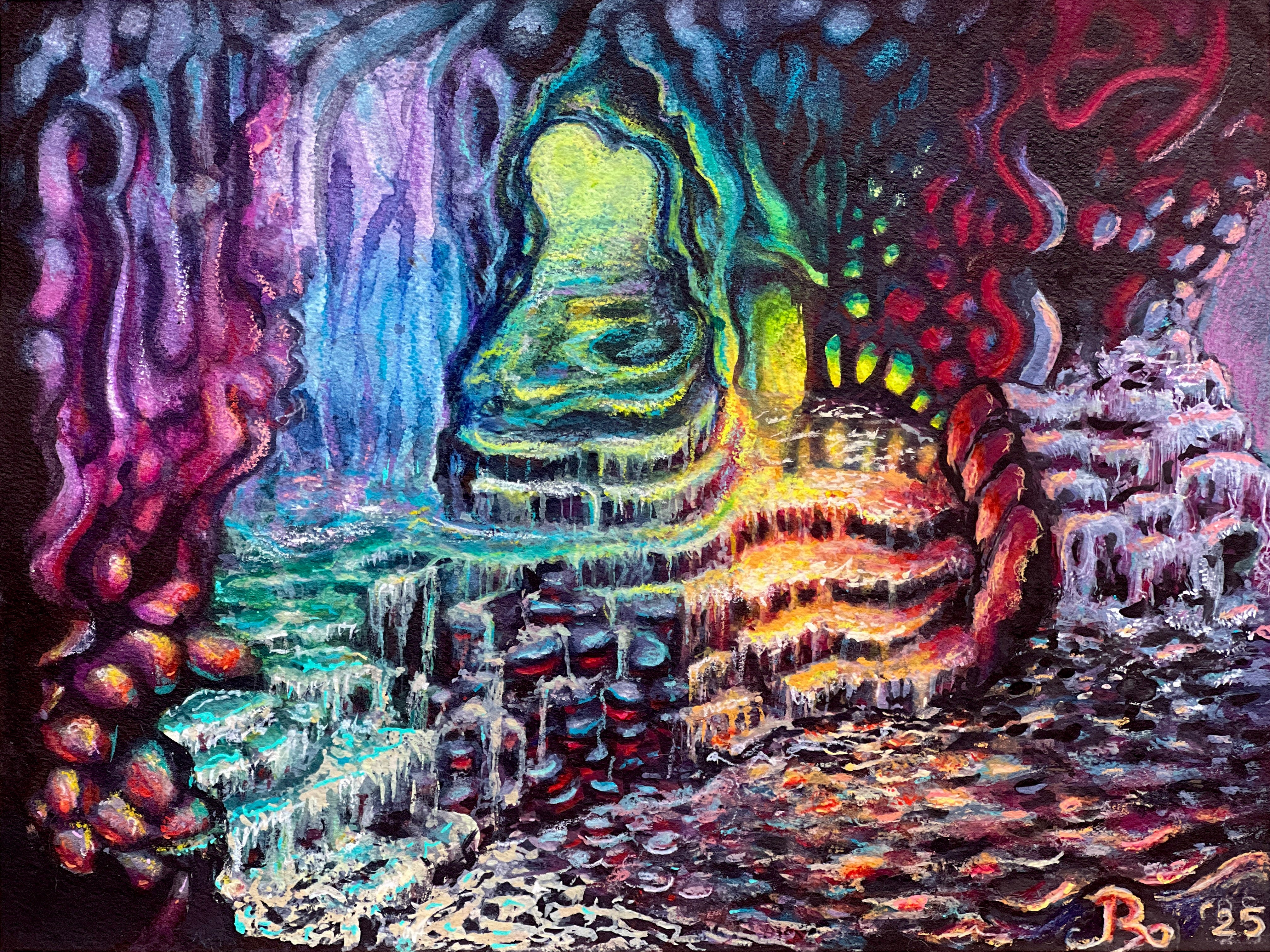
Her Dreams Flood Every Synapse
Resurrection. In the lab doing frankenshit. Even slower painting. Decalcomania. Plastic inevitable allure. Dad helped. Riptides. The slouching curve.

“Mixed media” here is the cut-out for “in the lab doing frankenshit”. I don’t sign a painting I don’t like, but sometimes I have to use every medium within reach before that happens. For example:
Watercolor
Traditional gouache
Acrylic gouache1
black india ink
pigmented chromatic india ink2
colored pencils
water-soluble crayons3
wax crayons4
300gsm (140-lb) 100% cotton, cold-pressed paper
I started this painting in the early spring of 2022. Taped off the edges of a 9 x 12” block of all-cotton rag cold-pressed, and filled 2/3 of the sheet before some internal tempest drove me to pull off the tape and slice the unfinished painting from the block. I rarely dispose of a painting unless it endures a structural failure. This was not a structural failure. I just didn’t like, understand, or know how to proceed with what I had made yet, but hoped some day I would. Until that happened, I would need the next sheet on the block. So I sliced off the painting and hid it on a shelf out of sight so I would stop obsessing over it.
What happened? What wall did I hit? What made me stop? Still not entirely certain but I have a few hypotheses. Let’s roll up our sleeves and get into it.
In the mud season of 2022, I had just set up the space I call both studio and laboratory. Just before we moved, during that previous autumn. I had started painting again after ten years of mostly dyeing yarn with the occasional side doodle or occasional tea painting. When I painted before, I used watercolor merely as a finishing accent. But this time I had gone down a tiny rabbithole and come back with a small but respectable collection of professional watercolor paints and a refreshed nerd-on for pigment properties.5 Before I scaled up to 9” x 12”, I had been working on much smaller A6 (4.1” x 5.8”) watercolor 100% cotton-rag postcards, which I had acquired for a song.6 My first piece was from a photo-reference, which I sketched out freehand and transferred to the paper. Probably my one and only instance of orthodoxy when it comes to watercolors: drawing, then a succession of washes executed in a focused color palette. That’s great and all, but it felt a little color-by-numbers for my comfort. I loved how it turned out, but I didn’t want to do it again.
The following paintings were more intuitive, based on a preliminary mark-making technique called decalcomania, so beloved by the Surrealists —Max Ernst, in particular. Decalcomania involves laying down paint, then pressing a textured material into the wet paint. A paradox of accidental intent. Any number of materials can be used, but I grabbed what I had to hand: gift tissue paper, bubble-wrap, the saran wrap I used for steaming hand-painted skeins of yarn. Tissue paper could not be left in place to dry unless I wanted tissue stuck to my painting. The bubble-wrap was the large-bubble kind, which left an aggressively cartesian grid of massive polka dots on the tiny postcards. Wrong scale. But the saran wrap! I have a long roll, and could cover several postcards with a single narrow strip. Even wrinkled and convoluted. Such amazing looking marks. They could be roots, branches, waves, veins, stems, clouds, and water. As long as I put down plenty of paint, and left the clingwrap to dry, I got the most amazing shapes. Some I left as-is. Some I traced with black, white, and pigmented india inks.


But here’s the catch: these marks required the initial static generated by the plastic as it kissed the paint. I tried rinsing the used plastic afterwards and reusing, but could never achieve those miraculous shapes with the reused plastic. On the small postcards, the waste was not negligible by any stretch— single-use is still single-use— but I could get three to five postcards’ worth out of a fairly narrow strip. When I scaled up, the story changed. The strip of plastic which had once yielded marks across so many cards now only got me a third of the 9” x 12” sheet. As much as I loved the marks, I hated where the painting was going, the plastic started to feel like a dependency, and I just couldn’t face a future of single-use plastic, no matter how cool the marks looked.
This summer I retrieved the abandoned, unfinished thing. I wish I had taken a picture of it, but I’ve been haunted by my own work before and I was not in the mood for any of that nonsense. I set to work, first filling in the final 1/3 of the page. And of course I got stuck. Luckily, Dad was there. He’s not a painter, but he has an amazing eye and I trust him. He told me what he liked and didn’t. Here’s the funny part: I don’t remember exactly what he told me, but I acted on it. Whatever he told me, it got me past the stuck part. Enough that I was finally able to dig in and let time be something that happens to other people. I painted all the way to the edge, where before had been a white border, which got wonkier and wonkier without additional tape. So I finally did away with it altogether.
This is a piece where I kept thinking I was finished, I kept adding a signature, only to be woken at 4am because the painting needed a tiny change— each change obliterating my signature. I needed to paint until I couldn’t add another mark, until my dreams lived in every color choice, every new mark. Hard to say what counts as “finishing” a painting, but I got to a point where I could sign it, and allow us both to rest at the end of three years. I don’t know if I love it as much now as I did while I worked on it— it’s more illustrative and less abstract than my usual. But finishing this piece gave me the confidence to disrupt the Pretty Stage and finally complete The Morning of the Magicians.
Golden SoFlatt matt acrylics. I have a small shopping bag of free samples from work. Free paint is free paint.
Dr. PhMartin Bombay india inks. An old favorite. Lightfast, archival, vivid. Yum.
Caran d’Ache Neocolor II crayons. Truly revolutionary art supply. If you save the shavings and add water you get an opaque watercolor paint.
Caran d’Ache Neocolor I crayons. My coworker calls them “crayons for grownups.” Accurate. After using these, Crayolas are total weak-sauce.
No other paint medium allows pigments to show us exactly who they are and how they behave quite the way watercolor does. As a binder, watercolor uses gum arabic — the miraculous water-soluble resin of the Sahara-dwelling acacia tree.
In the world of fine art papers, “a song” becomes a relative term. Once you get involved with cotton or linen fiber papers— not made with wood pulp, in other words— the cost and price rise exponentially. All-cotton watercolor papers may be among the most expensive of art supplies. But if you’re going to splurge on anything: brushes, paint, or paper, let it be paper.
I love how your work subverts what I expect from watercolor. You create these goopier forms that I associate with oil and acrylic. The contrast makes for a rich viewing experience. Cool to learn more about the technique you use to achieve this. Her Dreams Flood Every Synapse is incredible - made think of being in a cave and the lights go out and I can see all the reverse colors of what I'd been staring at. Also, really like the world I can feel from the top and bottom left postcards in the 9-square panel.
Fascinating. I used to interview visual artists and I would go to their studios and spend a couple hours and they would show me their work and their techniques as we talked. Great paintings. I'm particularly fond of the first one in your grid, with the purple, kind-of-crystally "sky." Thanks.